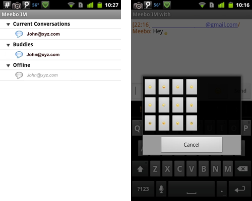
Since the apps of interest are from the same company, they should have the same user interface standard, even if the iPhone versions and the Android versions are developed by different people. But why do they look so different? Is it because iPhone developers are better at user interface design? Is it because the iPhone development environment is better than the Android’s? Is it because iPhone users care more about user interface? Or is it because Android itself implants the ignorance of beauty, usability and focus on details into the community at the first place?
Funny comparison of some screens from companies that have considerably nicer looking apps on iPhone than their Android counterparts.