How much information do you need in a welcome screen? How much information does Microsoft usually put there, and Apple? How much information do you need related to the choices you can make?
This is a bit funny. In Windows Vista, Microsoft will launch Windows Media Player (which means that Windows Media Player 11 is also delayed until next year)
Screenshots of the latest build of Vista can be found here and there, and I found this Welcome screen for Windows Media Player:
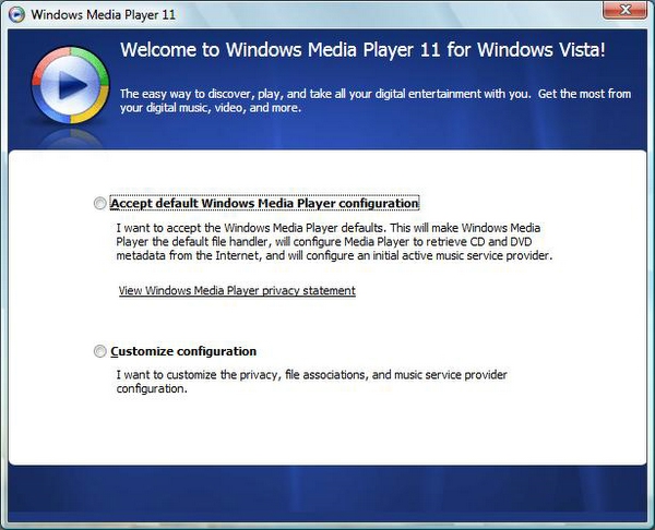
As far as can be seen, this is the welcome screen - but it may very well be the first step in a Settings Wizard. But for the sake of argument, let's say it's the welcome screen. Note the sheer amount of information the user has to read that are related to the choices he can make on this screen. (Note also that the controls look like radio buttons but there isn't an execute choice control, which kind of implies that they look like radio buttons but act like buttons). The two choices a user can make is either accept the default settings or create their own, customized settings.
So, what if Apple had a similar Welcome screen. What would it look like? Maybe something like this:
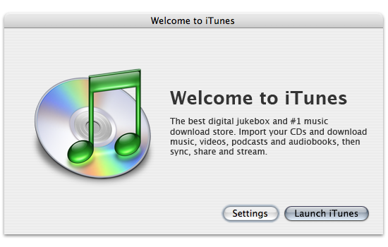
The difference is quite staggering. A screen like this displays quite easily that the user doesn't have to know about any settings being set in any way unless he or she specifically chooses to manipulate them. Just mentioning "default settings" raises the question of what the default settings are. Why must I choose to accept them? Can they be bad?
I am well aware that iTunes, when launched the first time, starts a "first launch" Wizard that asks about whether iTunes should be the default application for music and so on. Maybe WMP11 does not and this Welcome screen is all you see? It doesn't matter, I am more interested in comparing the amount of information that Microsoft and Apple usually put in their dialogs.